Client: Granite Impact
Category: Branding + Website
Role: Design
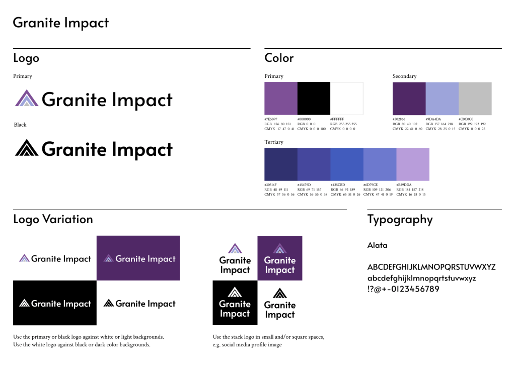
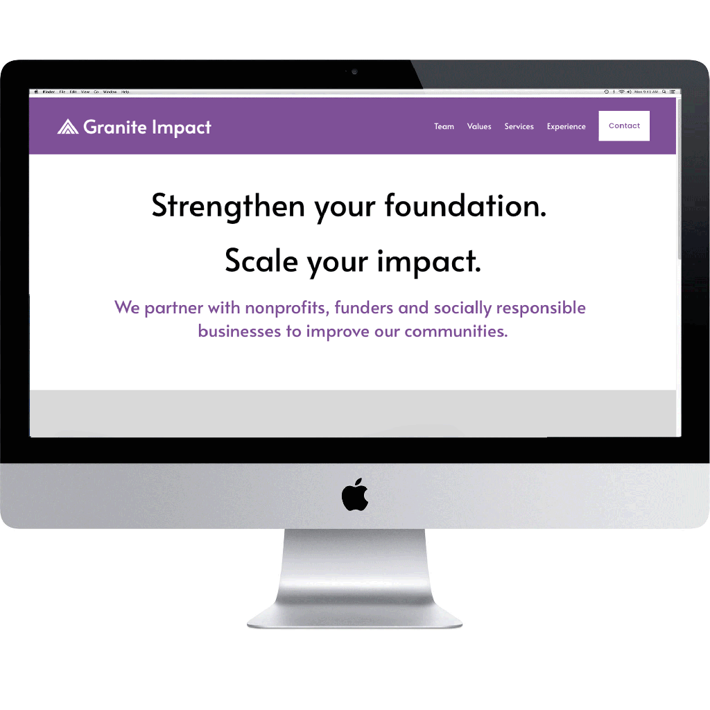
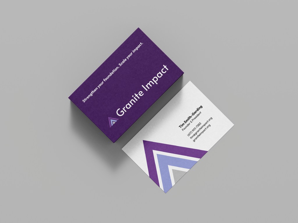
The founder of Granite Impact reached out to me in need of a logo and website for his new non-profit consulting company. “Granite” is a nod to his home state of New Hampshire. It is a very strong rock and reminds us the need to solidify foundations before pursuing growth. He envisioned a logo inspired by mountains and growth. I designed a few concepts based on mood boards I curated and presented to him. He was excited about the options and together we landed on a simple, clean, three-triangle design that illustrates strength and growth. I expanded on the branding package by designing business cards and a presentation deck template. For his custom built website, I designed wireframes in Figma and then built out the finished product on Squarespace.
Logo
Brand Guidelines
Website
Presentation Deck
A selection of slides from the deck template

Business Cards
Process
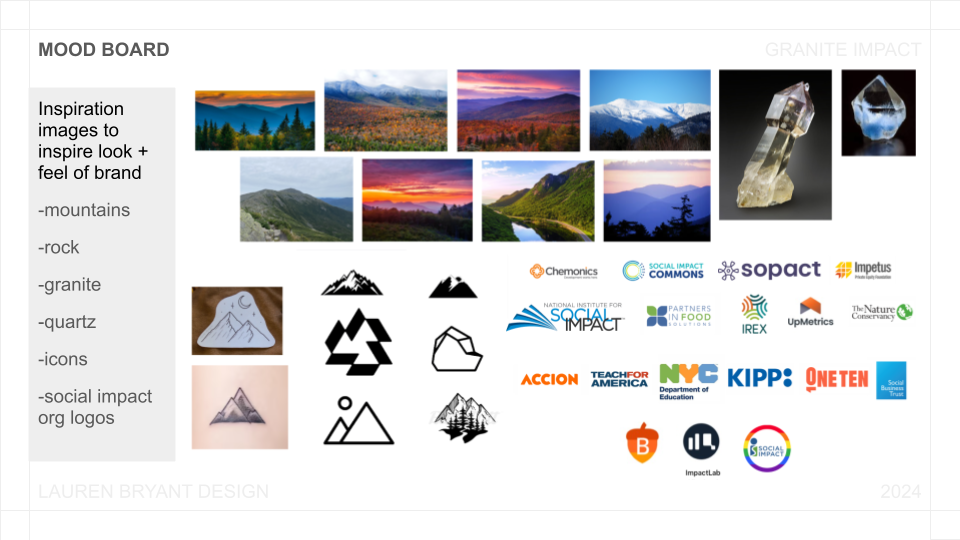
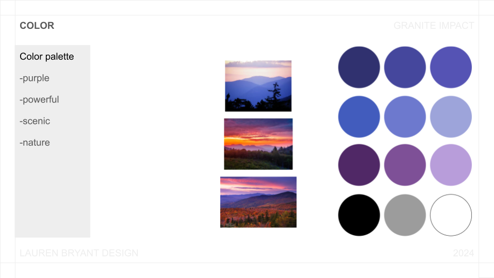
I always start by creating a mood board for inspiration. On our initial call, Tim mentioned feeling inspired by mountains and his mother’s favorite color – purple. I pulled images that followed this brief and caught my eye. I also collected a series of logos of other social impact organizations that we could draw inspiration from. The major takeaways at this stage were: mountains + clean and modern.